🔨 Tools, Supplies, and Jupyter.#
In Dun Morogh’s starter zone, the quest Tools for Steelgrill asks new adeventures to ferry a crate of tools to Beldin Steelgrill at his depot north-east of Kharanos. A plain courier run in an area built on supply runs and logistics.
ForgeNFinance began much the same way. I pulled a small toolkit from earlier projects, tested each piece, kept what pulled its weight, and dropped the rest. As the analysis grew and the posts piled up, those odds-and-ends settled into a tidy set of helper methods. They’re nothing exotic for anyone who lives in the Jupyter ecosystem, but they’ve proved handy enough that they deserve a brief write-up of their own.
One of the first things I wanted to cover is how I get the auction tables to appear the way they do. Specifically:
how the coin values for buyouts and bids are formatted with gold, silver, and copper icons (15🟡30⚪23🟠)
how item names link off to WowHead
how the rows themselves are colour-coded based on item quality or rarity (⬜️🟩🟦🟪🟧).
Before diving too far, it’s worth explaining the tools I’m using behind the scenes: something called a Jupyter notebook. For anyone unfamiliar, a Jupyter notebook is an environment that blends together written text and live code in a single document. It’s designed so you can write normal paragraphs (like this one) side by side with small code blocks that actually execute right there in the notebook. When the code runs, it produces outputs immediately below, whether that’s a table, a chart, or a simple calculation.
This setup is incredibly useful for me because it allows me to interweave explanations and visualizations. I can write a few lines describing what I’m about to calculate, run a snippet of code that does it, and then show only the output directly underneath. Throughout this post, you’ll see me reference how data frames are styled or how certain results are displayed. Those are all examples of the notebook running code cells to process data and immediately render the output in line with the discussion.
Item Tables#
Getting back to the table styles, the implementation is fairly straightforward. It relyies on some of the styling capabilities that come built into dataframes. I’ve written a reusable function that handles the heavy lifting: it takes a copy of each dataframe (df_viz = df.copy()), renames the columns to more visually appealing labels (df.rename), then applies formatting rules from a comprehensive style list (df_viz.style.format). Finally, it applies row-level styling so that different item qualities stand out (df_viz.apply(...)).
This pattern makes it easy to just pass any dataframe to the function, to present the standard “ForgeNFinance” style of tables.
def display_with_fnf_style(df, itemsdb, columns=[]):
    df_viz = df.copy()
    if columns:
        df_viz = df_viz[columns]
    df_viz.rename(
        columns={
            "id": "Auction ID",
            "name": "Item Name",
            "buyout": "Buyout",
            "quantity": "Quantity",
            "time_left": "Time Left",
            "bid": "Bid",
            # ...
            # ...
            "item_subclass_name": "Subclass",
            "sell_price": "Sell Price",
            "level": "Level",
            "required_level": "Required level",
            "purchase_price": "Purchase Price",
        },
        inplace=True,
    )

    return df_viz.style\
        .format(
        {
            "Quantity": "{:,.0f}",
            "Unit Price": "{:.2%}",
            "Bid Ratio": "{:.2%}",
            "Timestamp": "{:%Y-%m-%d}",
            "Auction ID": df_style__id,
            # ...
            "Item Name": df_style__linkify_item(itemsdb["indexes"]),
            "Buyout": df_style__gold_currency,
            "Bid": df_style__gold_currency,
            "Sell Price": df_style__gold_currency,
            "Purchase Price": df_style__gold_currency,
        })\
        .apply(df_style__row_entry(itemsdb["quality"]), axis=1)
Each of the functions are responsible for per-cell formatting, as in the case of which is responsible for converting the number to scientific notation, with the appropriate coinage emojis.
Gold Currency#
Each of the df_style__ functions handles specific per-cell formatting. For example, the df_style__gold_currency function converts numeric values into a simplified scientific notation and appends the appropriate coin icons based on whether the value is best represented in gold, silver, or copper. In practice, I try to avoid including too much detail at the silver or copper level, since it tends to clutter the tables without adding meaningful insight. If an item is listed for 100,000 gold and 2 copper, the real takeaway is simply that it costs around 100k. The formatting is designed to emphasize these broader price signals, rather than every last fractional piece.
def df_style__gold_currency(copper):
    if pd.isna(copper):
        return "-"

    gold = copper // 10_000
    silver = (copper % 10_000) // 100
    copper = copper % 100

    parts = []
    if gold:
        parts.append(f"{abbreviation(int(gold))}🟡")

    if silver:
        parts.append(format_coinage(silver, "⚪"))

    if copper:
        parts.append(format_coinage(copper, "🟠"))

    if not parts:
        return "0🟠"

    return " ".join(parts)
Styling the Rows#
The df_style__row_entry function handles styling the entire table row. Because it operates with the row context, it can look up details like item quality, name, or other properties that are useful for customized formatting. This is how setting the background color based on quality works. This is especially helpful for distinguishing rare or epic items at a glance.
This function uses a pattern where one function returns another. When I call df_style__row_entry, I give it my itemsDB, which contains details about all the items listed on the auction house. The outer function then builds and returns a new function formatter that remembers this itemsDB. Later, whenever formatter is called on a specific row of the table, it uses that stored context to decide how to style the row.
If you aren’t familiar with mathematics or programming, you can think of it like this:
It’s like building a mold for a sculpture. You craft the design, and create the mold with all the details it needs. Then anytime you pour something into it, it automatically comes out shaped the right way.
This is important because, due to the way DataFrame styling operates in Pandas, you don’t always have every bit of row-level data immediately available inside the styling call itself. By giving the inner function access to itemsDB, it can still perform any necessary lookups to determine how best to format or color the row.
def df_style__row_entry(itemsdb):
    def formatter(row):
        idx_map = {col: i for i, col in enumerate(row.index)}

        styles = []
        if 'Quality' in row:
            styles = [f"background-color: {item_quality_bg_colormap.get(row['Quality'], "gray")};color: #073545;font-weight: 550;"] * len(row)
        else:
            styles = [f"background-color: {item_quality_bg_colormap.get(itemsdb[row['Item Name']], "gray")};color: #073545;font-weight: 550;"] * len(row)

        if 'Item Name' in idx_map:
            styles[idx_map['Item Name']] += f"text-align: start;"

        return styles
    return formatter
And those are really the core pieces that make up the styling of the rows. At that point, I can just call the function, pass in any of the data frames I want, and display it with the styles. This looks something like:
display_with_fnf_style(df_to_show, item_lookup, ['id', 'name', 'buyout', 'quality_name'])
| Auction ID | Item Name | Buyout | quality_name | |
|---|---|---|---|---|
| 0 | 1970438061 |
Plans: Artisan Skinning Knife | 30🟡 | Rare |
| 1 | 1970477642 |
Super Cooling Pump | 10k🟡 69⚪ | Common |
| 8 | 1970482239 |
Spaulders of Egotism | 15k🟡 30⚪ | Epic |
| 15 | 1970485987 |
Expeditionary Chopper | 1.5k🟡 | Uncommon |
| 19 | 1970486995 |
Loosely Threaded Hat | 50🟡 01⚪ | Poor |
| 11939 | 1973664815 |
Rethu's Incessant Courage | 182.8k🟡 01⚪ | Legendary |
Code Blocks#
I actually don’t typically show all of the code blocks when I write these posts. That’s mainly because it can end up confusing things. When working with analysis there’s often quite a bit of Python and Pandas code that’s hard to follow at first glance. Even in the simple example above, just producing one of each item quality in a table involves surprisingly confusing looking code. I won’t delve into all of that here, but needless to say, it’s not the sort of code that’s easily understood on a quick read, and it tends to break up the flow of the blog. So I generally prefer to hide the mechanics of how these tables are created and focus instead on showing the results.
This also touches on something interesting: if you’ve never worked with a Jupyter notebook before, you might not fully see why all this code is woven throughout the post, or what role it plays. Jupyter notebooks combine written explanations—like the text you’re reading now—with executable code blocks that immediately produce outputs. It’s a kind of input-output design: I can write a short passage that says, “Analyze this data and give me back these insights,” and then run a cell that does exactly that, displaying the results right below. I realize I may have put the cart a bit before the horse by jumping directly into how some of that code works earlier, but I wanted to give at least a glimpse under the hood before tying it all together.
The Data#
I haven’t talked much yet about how I actually read in the data that I’m analyzing. The data itself is broken up into two main parts. The first is the auction listings. If you look at the tables I’ve shown, you’ll see things like an Auction ID, which is just a unique identifier for a specific listing on the auction house. A unique identifier is like a special name tag that makes sure each thing has its own label, so we never mix it up with anything else. Within the listing, is limited details about the actual item being sold.
That’s because the listing data doesn’t bother to include all the descriptive details about the item itself. Instead, it stores an item ID and a few unique properties or modifiers. In World of Warcraft, items can have small variations such as differing stamina or strength, or special modifiers. These also show up in things like battle pets, which have different levels and stats. The auction listing tracks these distinctions, but it doesn’t include something like the name “Plans: Artisan Skinning Knife.” It simply keeps a unique identifier that says that is item 223051.
So to get all the actual item details, I rely on a second dataset. This is a large database of every item, indexed by its unique ID. When I load my data, I’m actually reading from these two sources: one for the aggregated auction listings, and another for the comprehensive list of items. I also keep this item database available more generally within the code, for whenever I run into an edge case or need to look up additional details.
"223051": {
  "id": 223051,
  "name": "Plans: Artisan Skinning Knife",
  "description": "Teaches you how to craft Artisan Skinning Knife.",
  "quality": {
    "type": "RARE",
    "name": "Rare"
  },
  "level": 1,
  "required_level": 1,
  "item_class": {
    "name": "Recipe",
    "id": 9
  },
  "item_subclass": {
    "name": "Blacksmithing",
    "id": 4
  },
  "inventory_type": {
    "type": "NON_EQUIP",
    "name": "Non-equippable"
  },
  "purchase_price": 250000,
  "sell_price": 50000,
  "max_count": 0,
  "is_equippable": false,
  "is_stackable": false,
  "purchase_quantity": 1
}
Note
In the above JSON, you can see the name is accessible by name, or the quality by quality.name. If you know the id of 223051, you can look up everything in the above within code.
Pretty Charts#
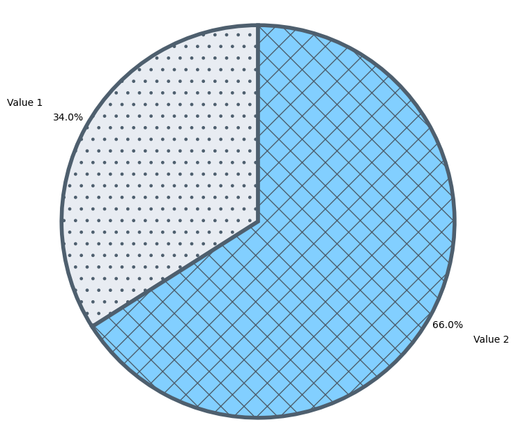
For actually creating the pie charts, bar graphs, box plots, and any other visual summaries, I use two Python libraries called matplotlib and seaborn. These libraries handle all the heavy lifting of drawing the charts. If you’ve ever worked in a spreadsheet tool (Excel/Sheets/AirTable/Calc), it’s somewhat similar: you point to a set of data, insert a chart, and then customize it as needed. Here, instead of clicking around, I write a bit of code that defines how the chart should look and what data it should use.
fig, ax = plt.subplots(figsize=(8, 8))
wedges, texts, autotexts = ax.pie(
    df_viz,
    labels=["Value 1", "Value 2"],
    colors=['#e8ecf2', '#82cfff'],
    autopct='%1.1f%%',
    pctdistance=1.1,
    labeldistance=1.25,
    startangle=90,
    wedgeprops={'edgecolor':'#4e5f6e'}
)
To feed these charts, I prepare what I call visualization data frames (df_viz). These are just tailored subsets of my main dat formatted to highlight exactly what I want to show. For example, if I’m making a pie chart, I might filter out any categories that fall below 1% so they don’t clutter the visualization. Because this is all done in code, I have very fine-grained control over what gets displayed and how.
I use these tools to set up most of the visual breakdowns you see here. Whenever possible, I also try to apply a consistent color scheme and include things like hatchings to add small patterns on top of colors to help people distinguish chart sections, They aren’t strictly necessary since I also label each section directly, but I find they break up the chart visually and keep it from looking too flat.
fig, ax = plt.subplots(figsize=(8, 8))
wedges, texts, autotexts = ax.pie(
    [0.34, 0.66],
    labels=["Value 1", "Value 2"],
    colors=['#e8ecf2', '#82cfff'],
    autopct='%1.1f%%',
    pctdistance=1.1,
    labeldistance=1.25,
    startangle=90,
    wedgeprops={'edgecolor':'#4e5f6e'}
)
hatches_for_pie_chart_wedges(wedges, [".", "x"])
ax.axis('equal')
plt.show()